Several years later, when it dawned on me that having an up-to-date website might be advantageous (rather than one that reflected my activities of a decade earlier), I began to search for someone who understood this mysterious code. The place to find people who knew about things like websites was obviously online.
So, I placed an ad on guru.com. “Wanted: A computer-type person who can put up a five-page website for me. I write books.” Within three days I was deluged by dozens of emails. Soon, the offers — ranging from $699 to $4000 — numbered in the hundreds. I began to receive staticky Skype calls late at night from Dubai. “What exactly do you want?” they asked. “SEO? Joomla? Slideshows?” I couldn’t answer any of their questions. I despaired.
This was my first mistake: I assumed that other, more technical, people would be able to help me design my website. My second mistake came shortly afterward.
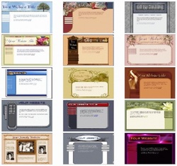
Realizing that I knew nothing about websites, I began to investigate. I discovered that there were free websites available everywhere, and that they were based on templates. What’s more, these templates required no computer skills whatsoever. They were designed for people like me. (And they were used by those very people who wanted to charge me $699 for one page.)
I began to look at templates. Oh, lord. There were thousands of them. I spent days looking at WordPress templates, Google templates, free templates of all kinds. My head hurt.
This was my second mistake: I assumed that I could pick a template. I couldn’t — there were too many of them, and none of them seemed appropriate for a writer. Then the realization hit me. I was going about this all wrong. There were other authors in the world, and they had websites! All I needed to do was find one that I liked and copy the format.
I went to Smart Author Sites and looked at their clients’ websites until I found one I liked. I also browsed the membership profiles on the Authors Guild site. (Lots there!) Then, I went to Weebly, which is the simplest website builder for the technologically challenged, and located a template that was closest to the author’s website I had found. (WordPress offers more, but I was simply not adept enough to figure it out.)
Looking at what other authors had done helped me to choose a good template on Weebly, which I accomplished painlessly in a less than an hour. From there it was easy. I imitated. (And, unless reinventing the wheel is your idea of fun, so should you.)
Components of an author’s website
This is the website model used by hundreds of successful authors (and which I appropriated without hesitation):
- The first page should consist of a photo of you that shows your personality — according to your subject matter (children’s book authors, smile! and look trustworthy; serious literary novelists, look deep). There should be a short, interesting bio. This page is also where you can put the latest professional news about yourself — upcoming publications, endorsements, speaking engagements, and so on. (This page can be reversed with Page 2. It depends on whether you want to put you or your books front and center.)
- The second page features your books: images of the covers, one paragraph descriptions, and where to purchase. (This page can be reversed with Page 1.)
- Page three is an enticing excerpt from forthcoming work or your most recent release.
- Page four is a selection of your other published writing — essays, short stories, if you have written them. Or page four can be an events calendar. (This page is really up for grabs. But, please, no photos of your cat.)
- The fifth page is your blog. Everyone who is anyone writes a blog. Besides, writers’ blogs are always read by prospective agents.
- “Contact us” comes last. You must make yourself available to potential readers, agents, and Nobel Prize nominations. Don’t post your email address — use a form to avoid spam and dodgy proposals of marriage.
A website should be easy to read. Stick to conventional typefaces, and do not, under any circumstances, choose a light typeface against a dark background. It’s true you can do just about anything with typefaces and colors — but don’t let that tempt you into chartreuse or, god forbid, brown. (I’ve seen that combination on an author’s website, and it’s not only ugly, it’s a sin.)
Avoid trends. Gray backgrounds used to be a trend. They were hard to read and have now been replaced by large images. Huge images that force the reader to scroll down to get to the good stuff are a waste of space, and hopefully will go the way of gray backgrounds. (The only images should be of you and your books.) The risk of following trends is that your website will rapidly look outdated. Stick to a classic look and your website will never go out of style.
Final words
Even if you have not yet been published, you absolutely MUST have an author’s website. Websites are not optional; they are a requirement for anyone with something to sell. (Remember — authors are not only selling their writing, they are selling themselves, so let your personality shine through.)
At the very least, put up your first page (bio and photo), a blog, and a contact page.
Unless it is a chapter from your forthcoming book, do not post your unpublished writing for readers to critique!! There are forums for that sort of thing. Your website is where you must come across as a professional. Take yourself seriously, and others will as well.
Postscript: I ended up with something phenomenally simple. You're looking at it.
Helpful articles:
12 Author Websites That Get It Right
29 Author Websites with Stellar Designs


 RSS Feed